This geom serves to visualize prediction objects which usually results from
a call to predict.bru(). Predictions objects provide summary statistics
(mean, median, sd, ...) for one or more random variables. For single
variables (or if requested so by setting bar = TRUE), a boxplot-style geom
is constructed to show the statistics. For multivariate predictions the mean
of each variable (y-axis) is plotted against the row number of the variable
in the prediction data frame (x-axis) using geom_line. In addition, a
geom_ribbon is used to show the confidence interval.
Note: gg.bru_prediction also understands the format of INLA-style posterior
summaries, e.g. fit$summary.fixed for an inla object fit
Requires the ggplot2 package.
Usage
# S3 method for class 'data.frame'
gg(...)

# S3 method for class 'bru_prediction'
gg(data, mapping = NULL, ribbon = TRUE, alpha = NULL, bar = FALSE, ...)

# S3 method for class 'prediction'
gg(data, ...)

# S3 method for class 'bru_prediction'
plot(x, y = NULL, ...)

# S3 method for class 'prediction'
plot(x, y = NULL, ...)
Arguments
- ...
Arguments passed on to
geom_line.- data
A prediction object, usually the result of a
predict.bru()call.- mapping
a set of aesthetic mappings created by
aes. These are passed on togeom_line(). If "fill" is present, it is passed togeom_ribbon().- ribbon
If TRUE, plot a ribbon around the line based on the smallest and largest quantiles present in the data, found by matching names starting with
qand followed by a numerical value.inla()-stylenumeric+"quant"names are converted to inlabru style before matching.- alpha
The ribbons numeric alpha (transparency) level in
[0,1].- bar
If TRUE plot boxplot-style summary for each variable.
- x
a prediction object.
- y
Ignored argument but required for S3 compatibility.
Functions
gg(data.frame): This geom constructor will simply callgg.bru_prediction()for the data provided.plot(bru_prediction): Generates a base ggplot2 usingggplot()and adds a geom for inputxusinggg.bru_prediction(). Returns a ggplot object.plot(prediction): Identical togg.bru_prediction().
See also
Other geomes:
gg(),
gg.RasterLayer(),
gg.SpatRaster(),
gg.Spatial,
gg.fm_mesh_1d(),
gg.fm_mesh_2d(),
gg.matrix(),
gg.sf()
Examples
# \donttest{
if (bru_safe_inla() &&
requireNamespace("sn", quietly = TRUE) &&
require("ggplot2", quietly = TRUE) &&
require("patchwork", quietly = TRUE)) {
# Generate some data
input.df <- data.frame(x = cos(1:10))
input.df <- within(
input.df,
{
y <- 5 + 2 * cos(1:10) + rnorm(10, mean = 0, sd = 0.1)
}
)
# Fit a model with fixed effect 'x' and intercept 'Intercept'
fit <- bru(y ~ x, family = "gaussian", data = input.df)
# Predict posterior statistics of 'x'
xpost <- predict(fit, NULL, formula = ~x_latent)
# The statistics include mean, standard deviation, the 2.5% quantile, the
# median, the 97.5% quantile, minimum and maximum sample drawn from the
# posterior as well as the coefficient of variation and the variance.
xpost
# For a single variable like 'x' the default plotting method invoked by
# gg() will show these statistics in a fashion similar to a box plot:
ggplot() +
gg(xpost)
# The predict function can also be used to simultaneously estimate
# posteriors of multiple variables:
xipost <- predict(fit,
newdata = NULL,
formula = ~ c(
Intercept = Intercept_latent,
x = x_latent
)
)
xipost
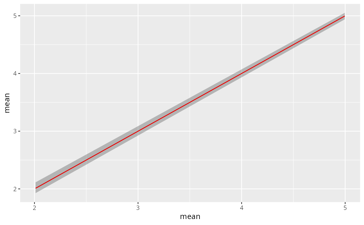
# If we still want a plot in the previous style we have to set the bar
# parameter to TRUE
p1 <- ggplot() +
gg(xipost, bar = TRUE)
p1
# Note that gg also understands the posterior estimates generated while
# running INLA
p2 <- ggplot() +
gg(fit$summary.fixed, bar = TRUE)
(p1 / p2)
# By default, if the prediction has more than one row, gg will plot the
# column mean' against the row index. This is for instance useful for
# predicting and plotting function but not very meaningful given the above
# example:
ggplot() +
gg(xipost)
# For ease of use we can also type
plot(xipost)
# This type of plot will show a ribbon around the mean, which visualizes
# the upper and lower quantiles mentioned above (2.5% and 97.5%).
# Plotting the ribbon can be turned of using the \code{ribbon} parameter
ggplot() +
gg(xipost, ribbon = FALSE)
# Much like the other geomes produced by gg we can adjust the plot using
# ggplot2 style commands, for instance
ggplot() +
gg(xipost) +
gg(xipost, mapping = aes(y = median), ribbon = FALSE, color = "red")
}
 # }
# }